Colors are a powerful tool in design and can greatly influence the mood and perception of a space or product. As we enter 2023, we are seeing a shift towards bold, vibrant hues as well as a return to nature-inspired shades.
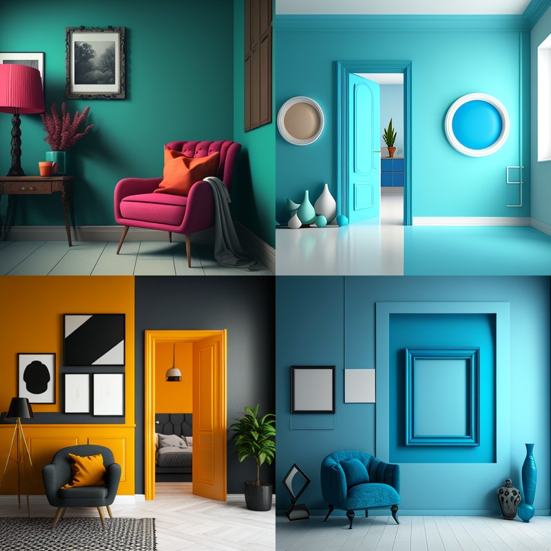
One trend for 2023 is the use of bright, bold colors. These statement shades add energy and playfulness to a design, and can be incorporated through statement pieces such as furniture or accessories. Shades of pink and red are particularly popular, with fuchsia being a standout color for the year. Yellow and green are also being used to add a pop of color and bring a sense of cheer to a space.
As we look ahead to 2023, it’s clear that color trends will continue to evolve and change. While it’s always difficult to predict exactly what the future holds, there are a few key trends that are already starting to emerge.
In contrast to the bold hues, we are also seeing a trend towards a more muted, toned down color palette. These soothing shades, often inspired by nature, bring a sense of calm and relaxation to a space. Soft blues and greens, as well as shades of lavender and pale pink, are being used to create a serene atmosphere.
Another trend for 2023 is the use of warm, earthy shades. These rich, natural colors draw inspiration from the outdoors and bring a sense of grounding to a space. Shades of terracotta, mustard, and rust are popular choices for adding a sense of warmth and depth to a design.
Neutrals are also having a moment in 2023, with a focus on soft, creamy shades rather than the stark white that has been popular in recent years. These off-whites, paired with natural wood tones, bring a sense of tranquility and understated elegance to a space.
Incorporating color into a design can be intimidating, but it’s important to remember that there are no hard and fast rules. The most important thing is to choose shades that speak to you and make you feel good. Whether it’s through bold, vibrant hues or soothing, nature-inspired shades, color has the power to transform a space and set the tone for the entire design. These vibrant hues are a departure from the more muted, subdued shades that have been popular in recent years, and they’re sure to make a statement in any space. Whether it’s a striking shade of red, a vibrant orange, or a bold pink, these colors are sure to turn heads and add a touch of drama to any room.
Another trend that’s starting to emerge is the use of unexpected color combinations. Rather than sticking to traditional color schemes, more and more people are experimenting with pairing unlikely shades together. This can create a dynamic, visually interesting look that’s sure to make an impact. Some examples of unexpected color combinations include pairing pastel shades with bold, primary colors, or mixing warm and cool shades together in a single palette.
Another trend that’s expected to continue gaining traction in 2023 is the use of muted, earthy tones. These shades, which include colors like terracotta, olive green, and muted mustard, are inspired by nature and are a great way to add a sense of warmth and tranquility to a space. They work particularly well in home interiors, and can be paired with bold, colorful accents to create a cohesive look.
Another trend that’s likely to continue gaining popularity in 2023 is the use of monochromatic color schemes. This involves using different shades of the same color throughout a space, creating a cohesive and harmonious look. This trend works particularly well with shades of blue and green, and can be used to create a calming, serene atmosphere.
Overall, it’s clear that color trends in 2023 will be diverse and varied, with something to suit every taste and style. Whether you’re a fan of bold, bright hues or prefer more muted, earthy tones, there will be plenty of options to choose from. No matter what your personal style may be, it’s sure to be an exciting year for color in the world of design.
What is the color of the year 2022 2023?
Viridian Green is a shade of green that is often described as a muted, subdued green with a blue-gray undertone. It is a sophisticated and elegant color that can be used to create a calming, relaxing atmosphere.
Viridian Green can work well in a variety of settings, from home interiors to corporate offices. It is a versatile color that can be paired with a wide range of other shades, from warm, earthy tones to bold, vibrant hues.
In interior design, Viridian Green can be used to create a sense of tranquility and calm. It can be particularly effective in areas where relaxation is important, such as bedrooms or home offices. Viridian Green can also be used to add a touch of sophistication and elegance to a space, and can be paired with other shades of green, blue, or gray to create a cohesive color palette.
Overall, Viridian Green is a versatile and sophisticated color that can be used to create a calming, relaxing atmosphere in a variety of settings.
Green is a powerful color for a number of reasons. One of the main reasons is that it is often associated with nature and the outdoors. This connection to the natural world can make green feel calming and restorative, which can be especially beneficial in high-stress environments.
In addition to its associations with nature, green is also often associated with growth, renewal, and prosperity. This makes it a popular choice for businesses, as it can convey a sense of stability and success.
Green is also a color that is often associated with environmentalism and sustainability. As more and more people become concerned about the health of the planet, the use of green in branding and design can help convey a commitment to eco-friendliness.
Another reason that green is a powerful color is that it is often seen as a soothing and balancing shade. It can help to create a sense of harmony and calm in a space, making it a popular choice for hospitals and other healthcare settings.
Overall, green is a versatile and powerful color that can be used in a variety of settings to convey a wide range of emotions and associations. Whether you’re using it to create a sense of calm and tranquility or to convey a commitment to sustainability and the environment, green is sure to make an impact.
Why is good to have a color accent for your interior
There are several reasons why you might want to consider adding a color accent to your interior design.
One reason is that a color accent can add visual interest and drama to a space. By using a bold, contrasting color as an accent, you can draw the eye and create a focal point in a room. This can be especially effective in a space that is primarily neutral or monochromatic, as the accent color can help to break up the monotony and add some flair to the design.
Another reason to add a color accent is that it can help to define different areas or zones within a space. For example, if you have an open-concept living area, using different accent colors for the living room, dining room, and kitchen can help to create a sense of separation between the different areas and give them their own distinct identities.
Color accents can also be used to highlight certain features or elements in a room. For example, you might use an accent color on a single wall to make it stand out, or you might use it to highlight architectural details or artwork.
Finally, color accents can be used to add personality and character to a space. Whether you choose a bold and vibrant hue or a more subtle and understated shade, a color accent can help to reflect your personal style and make your home feel like your own.
Overall, adding a color accent to your interior design can be a simple but effective way to add visual interest, define different areas, highlight features, and add personality to your space.
What colors are good for seniors?
It’s not uncommon for people to have preferences when it comes to colors, and some people may prefer more neutral or subdued shades while others may prefer bold and vibrant hues. However, it’s not accurate to say that colors are only for “oldies” or that they are not relevant to people of all ages.
There are no specific colors that are “good” for seniors, as color preferences are often subjective and can vary from person to person. However, there are certain colors that may be more calming and soothing for seniors, particularly if they are living in a care facility or if they have health conditions that can be affected by their environment. In fact, color can play a significant role in shaping the look and feel of a space, regardless of the age of the people who will be using it. Different colors can create different moods and atmospheres, and can be used to convey different emotions and associations. For example, warm colors like red and yellow are often associated with energy and enthusiasm, and can be used to create a lively, welcoming atmosphere. On the other hand, cool colors like blue and green are often associated with calmness and tranquility, and can be used to create a more relaxing and peaceful environment.
Some colors that are often recommended for seniors include:
Soft, muted shades: These can help create a calming and restful atmosphere, which can be especially beneficial for seniors who may be living with dementia or other conditions that can cause anxiety or agitation.
Cool colors: Cool colors like blue, green, and purple are often associated with calmness and tranquility, and can help to create a peaceful and relaxing environment.
Bright colors: While bright, bold colors may not be suitable for every senior, some people may find that they help to lift their mood and provide a sense of cheer.
Ultimately, it’s important to consider the individual preferences of the senior in question when selecting colors for their environment. Some seniors may prefer bright, vibrant hues, while others may prefer softer, more muted shades. It may be helpful to ask the senior what colors they find most appealing, or to experiment with different shades to see what works best.
Overall, it’s important to remember that color is a powerful design element that can be used to create a wide range of moods and atmospheres, and is relevant to people of all ages.
Colors are always subjective
It’s true that colors are often subjective and what one person finds appealing may not be the same for another. Different people have different associations and experiences with different colors, and these associations can influence their perceptions and preferences.
For example, one person might associate the color red with love and passion, while another might associate it with anger and danger. These different associations can have a big impact on how people respond to the color.
In addition to individual differences, cultural differences can also play a role in how people perceive and respond to different colors. In some cultures, certain colors may have different associations and meanings than they do in other cultures. For example, in some cultures, white is associated with purity and innocence, while in others it may be associated with death and mourning.
Overall, it’s important to remember that color preferences are often subjective and can be influenced by a wide range of factors. While some colors may be generally considered more appealing or attractive than others, it’s important to consider the individual preferences and associations of the people who will be living with or using the space.