


Time on your phone is fine. Time on your wall can do a lot more. The right art wall clocks pull their weight twice: they keep you on schedule and act as real visual anchors in a room. The wrong ones? They’re unreadable wire doodles that look clever online and useless in real life.
This is your guide to choosing art wall clocks that actually work in modern homes—especially living rooms—without sliding into faux-vintage farmhouse clichés or “Is that even a clock?” art pieces.
What makes art wall clocks actually good?
Art wall clocks sit in an awkward middle ground: they’re decorative, but they still have a basic job. A good one nails three things:
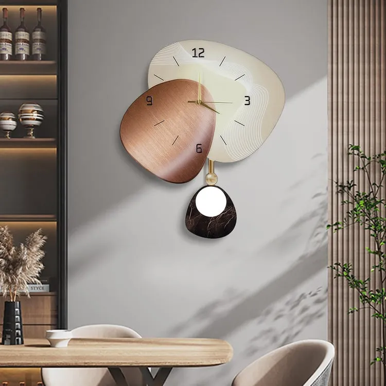
1. Clear function. You should be able to read the time from where you sit or work. If you have to stand up and squint, the design failed. Non-ticking quartz mechanisms are standard now and worth it for living rooms, bedrooms, and offices where noise is annoying.
2. Strong silhouette. From across the room, you should see a defined shape: a bold circle, a sunburst, a geometric frame, an organic slab of wood. If it visually dissolves into the wall, it’s decor clutter, not a focal point.
3. Real presence on the wall. An art wall clock is competing with large-format artwork and mirrors. It needs enough size and weight to stand beside the sofa, fireplace, or dining table and not look like an afterthought you grabbed at a supermarket.
Once those basics are in place, you can start getting into style: minimalist metal, abstract wall clock art, sculptural designer pieces, and so on.
Modern art wall clocks for living rooms: what works, what doesn’t
Living rooms are where most people go wrong with “modern art wall clocks.” The trend that refuses to die: ultra-thin wire frames with tiny hands that vanish from three meters away. They photograph well. They are a pain to live with.
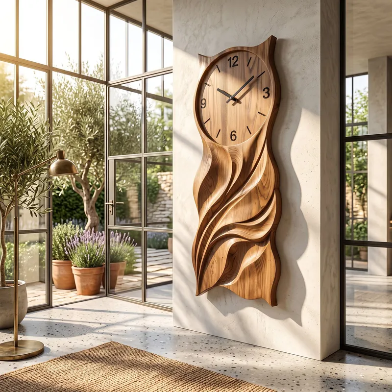
If you want modern art wall clocks for the living room that look sharp and still tell time, focus on these types:
Minimalist metal clocks. Black, brass, or mixed-metal frames with a clean round or geometric outline are reliable. Look for solid or semi-open faces with clear hands and minimal numerals. These sit well in contemporary, industrial, and Scandinavian rooms, especially over a sofa or sideboard.
Geometric clocks. Hexagons, layered circles, asymmetrical frames, and open constructions add structure to a plain wall without feeling heavy. These work best when the geometry is simple and the hands are bold. When the design turns into a tangle of lines with microscopic hands, walk away.
Wood-and-metal combinations. A walnut or ash face with metal hands and markers is a good answer if your room mixes modern lines with warmer textures—think fabric sofas, wood floors, and stone tables. Wood stops the clock from feeling too cold or office-like.
Acrylic or glass designs. Transparent or glossy faces look lighter and more graphic. They can sit on top of painted walls, paneling, or even patterned wallpaper without feeling too solid. Just make sure you won’t be fighting glare all day—glossy faces under downlights can become unreadable.
The non-negotiable: legibility
I’ve stopped pretending hyper-abstract designs with low-contrast hands are acceptable. If the hands disappear into a busy background or a tone-on-tone face, it’s not “minimal,” it’s badly resolved. You should be able to glance from the sofa and see the time, not guess whether it’s 3:10 or 3:40.
Rule: dark hands on a light or medium face, or light/brass hands on a dark face. Anything else is gambling with usability.
Large decorative wall clocks as statement art
Large decorative wall clocks can behave exactly like statement art. But they only work when they’re unapologetically big and tied to a clear style.
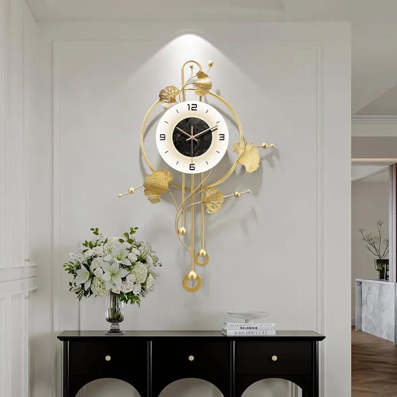
A 24-inch clock over an eight-foot sofa looks timid and cheap. It reads as “we felt obligated to put something there.” If you’re using a clock as the main piece above a sofa, console, or fireplace, go bold or don’t bother—hang art instead.
Good statement styles for modern homes:
Oversized round clocks. Simple, but still the easiest format to place. Over a sofa or mantel, aim for roughly 2/3 the width of the furniture below. Over a console, slightly smaller is fine but still generous.
Open-frame clocks. These give you the size without a heavy solid disk. Great for big walls in lighter rooms, or where a huge solid circle would feel like a shield. The key is strong numerals or markers and hands you can actually see.
Sunburst and mid-century-inspired clocks. These still work, especially in brass, bronze, or matte black. They add energy without going kitsch. Generic oversized Roman-numeral farmhouse clocks, on the other hand, already look tired. If you’re spending for a statement, choose real mid-century lines or clean industrial, not faux-vintage.
Horizontal and map clocks. Long, horizontal designs can balance wide sofas or consoles better than a circle. World-map or geographic motifs work for travel-focused homes and offices, as long as they’re graphic and not cartoonish.
Whatever format you pick, give the clock breathing room. The shape needs clean wall around it so you can actually read it and appreciate the form.
Unique designer wall clocks for contemporary interiors
This is where things get interesting—and where people waste money.
Designer-style art wall clocks often ditch traditional numerals and lean into sculptural shapes, unusual materials, and exposed mechanisms. Done well, they feel like small installations. Done badly, they look like a DIY project that lost its instructions.
Strong directions that usually hold up:
Sculptural metal compositions. Silver-and-black or brass-and-black metal forms that feel more like wall sculpture than a plain face. Good in minimal rooms that need one strong piece instead of lots of small art.
Organic, stone-like forms. Irregular slabs, stone finishes, or soft, rounded silhouettes suit Japandi and nature-heavy interiors—timber, linen, plaster, and neutral palettes. They work best large, where the irregular edge reads clearly.
Layered and reflective designs. Clocks that change with the light—smoked glass, layered acrylic, or metal planes—can be striking in contemporary interiors, especially if you have decent lighting to play off them.
What to avoid? Multi-piece “designer” clocks that scatter dots or numerals across half the wall. In photos, they look clever. In reality, they scream budget rental or AirBnB staging. One strong, sculptural clock always beats a bunch of little stickers pretending to be art.
Designer clock rule: form still follows function
Even the most artistic clock still has one job: show the time. So when you look at any unique designer wall clock for contemporary interiors, ask two questions:
Can I instantly find the hands? And can I tell the time from the distance I’ll actually use it?
If the answer is no, walk away. It’s wall art at that point—don’t pay a premium for a mechanism you’ll never use.
Abstract wall clock art for modern homes
Abstract wall clock art can be smarter than buying another canvas print. You get the visual hit of an artwork plus a functional center point.
Good abstract clock ideas for modern homes include:
Geometric faces with color blocking. Overlapping circles, lines, and blocks of color that echo your rug, cushions, or artwork. Great in living rooms and home offices as long as the hands sit in a quiet, high-contrast zone.
Asymmetrical silhouettes. Off-center or irregular outlines bring movement to a very straight-lined room. They work nicely on plain, light walls where their outline is easy to read.
Minimal “just hands” designs. A bare pair of hands on the wall can be effective in truly minimal rooms—white walls, clean joinery, almost no clutter. But only if those hands are large and high contrast. Tiny black hands lost on a dark wall are pointless.
Illuminated clocks. Backlit or edge-lit clock faces can double as ambient lighting in the evening. They suit modern homes with dimmers and layered lighting, especially in media rooms or open-plan living rooms.
The trick is alignment: your abstract clock should talk to something else in the room—an architectural line, a piece of furniture, a color story—so it feels intentional, not random.
Functional wall art clock ideas: where to put them
Placement either makes the clock feel like part of the architecture or like a random accessory. Use it strategically in the rooms where you actually look up for time.
Above a sofa. Treat the clock as you would a single large artwork: one generous round or horizontal design. Don’t clutter the area with lots of small objects fighting for attention. And again, size matters—think bold, not apologetic.
Over a fireplace. Fireplaces demand a strong vertical anchor. Choose a clock with a clear outline and strong contrast with the surround. If your fireplace material is busy (stone, brick, patterned tile), keep the clock simpler so it doesn’t compete.
Entryways. A decorative clock by the door gives you a last look at the time and sets the tone of the home. In small entries, go for a thinner profile and silent movement—no one wants a ticking echo chamber.
Dining areas. Clocks work well on the wall perpendicular to the table or over a sideboard. Metal, wood, or Art Deco-inspired pieces can echo the dining pendant and table legs so the whole zone feels cohesive.
Home offices. This is where legibility really matters. Pick a clock you can read from your desk without thinking, with strong contrast and non-ticking movement. Modern art wall clocks for a living room can double here if they tick those boxes.
Gallery walls. Here’s where people get it wrong: a tiny clock floating among large frames looks lost and makes the whole wall feel indecisive. Either make the clock the anchor piece in the composition or keep it big enough that it clearly belongs. Functional wall art clock ideas that pretend the clock is just another little print almost always backfire.
How to choose the right art wall clock: a quick checklist
- Measure the wall and the furniture below; for a statement, aim for a clock roughly 1/2–2/3 the width of the sofa/console.
- Stand at the distance you’ll usually view it from; pick a design where you can read the time instantly from that spot.
- Match materials to your room: wood for warmth, metal for a sharper architectural feel, glass/acrylic for lightness.
- Decide the role: focal point (go big and bold) or supporting piece (simpler, but still clear and legible).
- Check noise specs—look for “silent” or “sweep” quartz movement for living rooms, bedrooms, and offices.
- Check mounting: weight vs wall type, fixing points, and clearance from doors or tall backs of furniture.
- Look at lighting: avoid glossy faces in direct glare; consider directional light if you have sculptural surfaces.
Common art wall clock mistakes to avoid
You can dodge most disappointments by steering clear of a few repeat offenders.
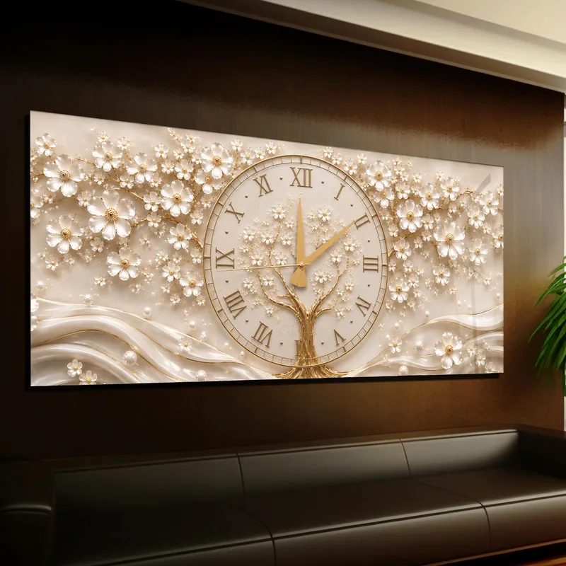
Too small for the wall. This is the number one problem. If you’re treating the clock as art, it needs art scale. Over big furniture, anything under 28–32 inches usually looks mean and temporary.
Wire doodles and micro-hands. If you’ve seen those ultra-thin modern art wall clocks for living rooms where the hands are 2 mm wide and the face is mostly air, you’ve seen this problem. They vanish in real life and don’t tell time.
Hands that blend into the background. Hands in the same finish as the face, or dark hands on dark faces, are design red flags. You will hate living with them, even if they look nice on day one.
Busy multi-piece kits. Those clocks that spread numbers and dots all over the wall almost never feel expensive. They look like temporary decor because they are. If you like a big composition, buy an actual large-format clock or real art.
Timid gallery mixes. A tiny clock buried in a dense gallery wall isn’t “quirky,” it’s messy. Make the clock either the visual anchor or leave it out of that wall entirely.
Mini FAQ: art wall clocks
How big should an art wall clock be over a sofa?
As a rule, aim for the clock to be about half to two-thirds the sofa width. For an eight-foot (240 cm) sofa, that usually means 32–48 inches (80–120 cm). Anything much smaller looks like a placeholder, not intentional design.
Are silent quartz movements worth paying for?
Yes. For living rooms, bedrooms, and home offices, a non-ticking or “sweep” quartz mechanism is absolutely worth a small price bump. Constant ticking is one of those things you can’t un-hear once you notice it.
Can an art wall clock replace a painting?
Yes—if you treat it with the same respect as a painting. That means enough size, real presence, and a design that works with your furniture, colors, and lighting. A strong large decorative wall clock as statement art is far better than a random medium print you don’t love.
If you remember nothing else, remember this: art wall clocks are functional sculpture. If they don’t work as both, they’re not worth the wall space.